scrollutil::scalingpctscrollutil::getScalingPct and Tk's Scaling Factorscrollutil::svgfmtstyleUtil.tclScrollutil is a library package for Tcl/Tk versions 8.4 or higher, written in pure Tcl/Tk code. It contains:
scrollutil::addMouseWheelSupport,
which creates mouse wheel event bindings for a given binding tag;The scrollutil::scrollarea mega-widget greatly simplifies the
creation of arbitrary scrolled widgets. It consists of a scrollable
widget and two scrollbars connected with that widget. The display mode
of each scrollbar can be static, dynamic, or
none. This scrolled window implementation also supports
the widgets that are scrollable in one direction only (e.g., entry and
ttk::entry) and respects the header component and title columns of tablelist widgets (this is freely
configurable).
The scrollutil::scrollarea widget is similar to BWidget ScrolledWindow and its snit-based equivalent widget::scrolledwindow, contributed by Jeffrey Hobbs and contained in tklib. The snit-based scrodget package by Aldo Buratti and its TclOO-based equivalent scrolledwidget contributed by Johann Oberdorfer are further scrolled window implementations. However, full tablelist support is only provided by the scrollarea widget, which is free from external dependencies like BWidget, snit, or (for Tcl 8.5) TclOO. It is also free from the shimmering problem in connection with text widgets, which the above-mentioned scrolled window implementations either share with the autoscroll package (contained in tklib) or circumvent in a suboptimal way.
The scrollutil::scrollsync mega-widget is designed for scrolling
several widgets simultaneously. Whenever the horizontal/vertical
position of the view in the window of one of its widgets changes, the view in
the windows of all the other widgets is automatically adjusted accordingly,
thus making sure that the view's position in these windows is kept in
sync. This mega-widget is horizontally and vertically scrollable, hence
it can be embedded into a scrollutil::scrollarea widget via the latter's
setwidget subcommand.
The scrollutil::scrollableframe mega-widget is a scrollable widget container. It contains a content frame, whose dimensions are typically larger than those of the widget itself. Arbitrary regions of this frame can be brought into view by scrolling, and the widget also provides a command for making individual widgets contained in the content frame visible in the scrollableframe window.
The scrollutil::scrollableframe widget is similar to BWidget
ScrollableFrame and iwidgets::scrolledframe. However, unlike these
widgets, which use a canvas for scrolling the content frame, it adjusts the
view with the aid of the place geometry manager, just like the
scrolledframe::scrolledframe command of the Scrolledframe
package by Maurice Bredelet (ulis) and its optimized and enhanced version
contributed by Keith Nash. For details on these commands see the wiki
page
https://wiki.tcl-lang.org/page/A+scrolled+frame
The canvas-free approach is more lightweight and integrates better in applications that use tile widgets.
The scrollutil::scrollednotebook mega-widget contains a
ttk::notebook within a scrollableframe and supports an arbitrary number of
unsqueezed tabs. Currently not visible tabs can be brought into view by
navigating with the mouse wheel, touchpad, or keyboard, and by scrolling with
the aid of the two arrow buttons placed on demand in the top-left and
top-right or bottom-left and bottom-right corners (depending on the
notebook's style). The widget also provides a command for making
individual tabs visible in the scrollednotebook window. Unlike the
ttk::notebook widget, whose -width option is quite often
overriden by the total width of the tabs, the scrollednotebook widget
respects the value of its -width option, regardless of the space
required by the tabs.
The scrollutil::plainnotebook mega-widget extends a ttk::notebook
having an arbitrary number of pages with invisible tabs by a ttk::frame to
its left or right containing, among others, a scrollableframe whose content
frame is the parent of a series of widgets that play the role of vertically
laid-out notebook tabs. Currently not visible "tabs" can be brought
into view by navigating with the mouse wheel, touchpad, or keyboard, and by
scrolling with the vertical scrollbar of the scrollarea containing the
scrollableframe. The widget also provides a command for making
individual "tabs" visible in the plainnotebook window. Unlike a
ttk::notebook widget with vertically aligned tabs, which in most themes has a
suboptimal look and whose -height option is quite often
overriden by the total height of the tabs, the plainnotebook widget respects
the value of its -height option, regardless of the space
required by the "tabs".
The scrollutil::pagesman mega-widget provides the basic functionality of a pages manager, meaning that it manages a list of windows, called pages, of which only one is visible at a time. By using it with plainnotebook widgets as pages, it is quite easy to write applications in which the user can descend from a plainnotebook to another one with a single mouse click and switch back in the same way to the original one. Everything needed for this navigation is provided by appropriate options and subcommands of the plainnotebook widget.
From the point of view of the commands related to mouse wheel and
<TouchpadScroll> event handling provided by the
Scrollutil package, the scrollability of a widget or widget container window
means that the associated Tcl command supports the xview scroll
number units and yview scroll number
units subcommands. The reason for requiring at least Tk
version 8.6b2 on Windows for the commands related to scrollable widget
containers is that in earlier Tk versions on this platform the mouse wheel
events were sent to the widget having the focus rather than to the one under
the pointer.
To make use of the user-friendly mouse wheel and
<TouchpadScroll> event handling in scrollable widget
containers via the Scrollutil package, follow the steps below:
<TouchpadScroll> event
bindings for the binding tag "all" or for the toplevel widgets
(including ".") having scrollable widget containers, by
invoking the scrollutil::createWheelEventBindings
command. In addition, register your scrollable widget containers for
scrolling via these bindings with the aid of the scrollutil::enableScrollingByWheel
command. Note that for the scrollutil::scrollableframe widget this
command is automatically invoked at creation time. The
above-mentioned bindings handle the mouse wheel and
<TouchpadScroll> events by scrolling the (innermost)
registered scrollable widget container that is an ascendant of the widget
under the pointer and is contained in the latter's toplevel.scrollutil::adaptWheelEventHandling
command for those widgets contained in registered scrollable widget
containers that have mouse wheel or <TouchpadScroll>
event (class) bindings. This step modifies the mouse wheel and
<TouchpadScroll> event handling as follows: If the
focus is on the widget under the pointer then the above-mentioned events
will be handled by the (class bindings of the) widget only, otherwise by
the bindings created with the
scrollutil::createWheelEventBindings command. Note that
this command accepts as optional argument the -ignorefocus
switch, which specifies that the above-mentioned events are to be handled
by the widget under the pointer (only), ragardless of whether that widget
has the focus or not."Date",
"Time", "DateTime", "IPAddr", or
"IPv6Addr" and the focus is on any of its siblings, then the
mouse wheel and <TouchpadScroll> events sent to this
entry should be handled by the entry widget itself rather than scrolling
the widget container that is an ascendant of the mentry. The
scrollutil::setFocusCheckWindow
command covers exactly cases like this.The mouse wheel and <TouchpadScroll> event handling
with the aid of the Scrollutil package was also tested to work with the
scrolledframe::scrolledframe command of the Scrolledframe
package by Maurice Bredelet (ulis) and its optimized and enhanced version
contributed by Keith Nash, as well as with the sframe command
implemented by Paul Walton. For details on these commands (which
provide further implementations of scrollable widget containers) see the
above-mentioned wiki page.
The comands related to mouse button 2 event handling are restricted
to the scrollutil::scrollableframe widget, which provides scan support via
the scan mark and scan
dragto commands. The mouse button 2 event bindings for the
binding tag "all", created automatically by Scrollutil, handle
the <Button-2>, <B2-Motion>, and
<ButtonRelease-2> events by scanning the content of the
(innermost) scrollableframe widget that is an ascendant of the clicked widget
and is contained in the latter's toplevel. By invoking the
scrollutil::adaptBtn2EventHandling
command for the widgets that are contained in a scrollableframe and have
mouse button 2 (class) bindings, the handling of these events will be
modified as follows: If the focus is on the clicked widget then the
events will be handled by the (class bindings of the) widget only, otherwise
by the bindings created for the "all" tag. This comes in
handy especially on Android, where it provides user-friendly scan support for
scrollableframe widgets via one-finger gestures.
Scrollutil is available for free download from the Web page
https://www.nemethi.de
The distribution file is scrollutil2.10.tar.gz for UNIX and
scrollutil2_10.zip for Windows. These files contain the
same information, except for the additional carriage return character
preceding the linefeed at the end of each line in the text files for
Windows.
Scrollutil is also included in tklib, which has the address
https://core.tcl.tk/tklib
Install the package as a subdirectory of one of the directories given by
the auto_path variable. For example, you can install it as
a subdirectory of the lib directory within your Tcl/Tk
installation.
To install Scrollutil on UNIX, cd to the desired
directory and unpack the distribution file
scrollutil2.10.tar.gz:
gunzip -c scrollutil2.10.tar.gz | tar -xf -
On most UNIX systems this can be replaced with
tar -zxf scrollutil2.10.tar.gz
Both commands will create a directory named scrollutil2.10,
with the subdirectories demos, doc, and
scripts.
On Windows, use WinZip or some other program capable of unpacking
the distribution file scrollutil2_10.zip into the directory
scrollutil2.10, with the subdirectories demos,
doc, and scripts.
Notice that in tklib the Scrollutil demos directory is
replaced with the subdirectory scrollutil of the
examples directory. Please take this into account when
reading the examples below.
The Scrollutil distribution provides two packages, called
Scrollutil and Scrollutil_tile. The main difference
between the two is that Scrollutil_tile enables the tile-based,
theme-specific appearance of scrollarea, scrollsync, and scrollableframe
widgets, and provides the themed scrollednotebook and plainnotebook widgets;
this package requires tile 0.8 or higher. It is not possible to use
both packages in one and the same application, because both are implemented
in the same scrollutil namespace and provide identical commands
(except for the commands scrollutil::scrollednotebook,
scrollutil::plainnotebook, scrollutil::addclosetab,
scrollutil::removeclosetab, and
scrollutil::closetabstate, which are provided by the
Scrollutil_tile package only).
To be able to access the commands and variables of the Scrollutil package, your scripts must contain one of the lines
package require scrollutil ?version?
package require Scrollutil ?version?
You can use either one of the two statements above because the file
scrollutil.tcl contains both lines
package provide scrollutil ...
package provide Scrollutil ...
Likewise, to be able to access the commands and variables of the Scrollutil_tile package, your scripts must contain one of the lines
package require scrollutil_tile ?version?
package require Scrollutil_tile ?version?
Again, you can use either one of the two statements above because the file
scrollutil_tile.tcl contains both lines
package provide scrollutil_tile ...
package provide Scrollutil_tile ...
You are free to remove one of these two lines from
scrollutil.tcl and scrollutil_tile.tcl,
respectively, if you want to prevent the corresponding packages from making
themselves known under two different names each. Of course, by doing so
you restrict the argument of package require to a
single name.
Since the packages Scrollutil and Scrollutil_tile are implemented in the
scrollutil namespace, you must either invoke the
namespace import scrollutil::pattern ?scrollutil::pattern ...?
command to import the procedures you need, or use qualified names
like scrollutil::scrollarea. In the examples below we have chosen the latter approach.
To access Scrollutil variables, you must use qualified
names. There are only 5 Scrollutil variables that are designed to be
accessed outside the namespace scrollutil:
scrollutil::version holds the current version
number of the Scrollutil package.scrollutil::library holds the location of the
Scrollutil installation directory.scrollutil::scalingpct is set when
loading the Scrollutil or Scrollutil_tile package via package
require to the scaling percentage corresponding to the
display's DPI scaling level. Scrollutil adapts, among others, the
default width of the Tk core scrollbars on X11 and that of the
ttk::scrollbar widget for the built-in themes alt,
clam, classic, and default to the
value of this variable. The currently supported values are
100, 125, 150, 175, and
200. You can use this variable, e.g., if you want to
create images of different sizes, depending on the DPI scaling level.
For example, if your application uses images of size 16 x 16 on an unscaled
display and scrollutil::scalingpct has the value
150, then the image size for this display should be
24 x 24.scrollutil::svgfmt is set to a Tcl list that you can
pass to the commands that create or manipulate SVG images as the value of
their -format option to make sure that your images will be
properly scaled.scrollutil::usingTile has the value
0 in the Scrollutil package and the value 1 in
Scrollutil_tile.The Scrollutil_tile package checks whether the required Tk and tile versions are present, by executing the commands
package require Tk 8.4-
if {$::tk_version < 8.5 || [regexp {^8\.5a[1-5]$} $::tk_patchLevel]} {
package require tile 0.8-
}
The second command above reflects the fact that, beginning with Tk 8.5a6, tile is integrated into the Tk core and therefore it should only be loaded explicitly when using an earlier Tk version.
scrollutil::scalingpctThe Scrollutil code sets the variable scrollutil::scalingpct
to the value returned by the public procedure
scaleutil::scalingPercentage of the scaleutil package, which is
bundled with Scrollutil. The way this value is computed depends on the
windowing system:
On Windows and Mac OS X/11+ the scaling percentage is computed from
Tk's scaling factor given by [tk scaling]. Note that
on Mac OS X/11+ the result is always 100, regardless of the
display's scaling level. On this system the desktop engine
automatically scales everything as needed.
On X11, computing the scaling percentage from [tk
scaling] is done as fallback method only, because the
implementation of display scaling is highly dependent on the desktop
environment and it mostly manipulates system resources that are resident
outside of Xlib, which Tk is based on. (Traditional X applications like
bitmap and xmag are also affected by this.)
With the partial exception of Xfce and MATE (see below), the procedure
computes the scaling percentage from the value of the X resource
Xft.dpi, by executing the xrdb application.
On GNOME-based systems where xrdb is not installed per default
(e.g., Solus GNOME and Solus Budgie), it uses the xrandr
application and the file ~/.config/monitors.xml instead.
scaleutil::scalingPercentage to 200, otherwise it
will be computed from the value of the font DPI, given by the X resource
Xft.dpi. The value of the font DPI can be set in the
Fonts tab of the Appearance dialog or (on Linux Lite 5+) via
the HiDPI Settings dialog.scaleutil::scalingPercentage
auto-detects which one of the "Regular" ("100%") and "HiDPI" ("200%") modes
corresponds to the preset "Auto-detect" ("auto detect") mode. If the
"HiDPI" ("200%") mode was selected by the user or auto-detected by the
procedure, then the scaling percentage will be set to 200,
otherwise it will be computed from the value of the font DPI, given by the
X resource Xft.dpi. The value of the font DPI can be set
via the Font Rendering Details dialog, which in turn can be opened
from within the Fonts tab of the Appearance Preferences
dialog.100
or 200. In newer GNOME and Budgie versions on Ubuntu one
can enable the x11-randr-fractional-scaling as experimental
feature, which adds (at least) 125 %, 150 %, and 175 % to the list of
supported scaling percentages. Note that, due to the way this
fractional scaling is implemented, the value returned by
scaleutil::scalingPercentage will be 200,
regardless of the selected display scaling. Cinnamon versions 4.6 and
later also support fractional scaling; if activated then the scaling
percentage returned by the procedure will be 200, regardless
of the selected display scaling.100 or 200. In newer GNOME
versions one can enable the experimental feature
scale-monitor-framebuffer, which adds (at least) 125 %, 150 %,
and 175 % to the list of supported scaling percentages. With this
feature enabled, the value returned by
scaleutil::scalingPercentage will be 100 for
older GNOME versions and 200 for newer ones, regardless of the
scaling level, due to the fact that in this case, instead of window
contents, monitor framebuffers will be scaled in a logical pixel coordinate
space.100,
125, 150, 175, or 200,
depending on the display's scaling level.100, regardless of the display's
scaling level, while for newer KDE versions it will be 100,
125, 150, 175, or
200.On GNOME and Budgie, the display scaling can be set in the Displays
page of the Settings dialog, but the value of the X resource
Xft.dpi, which is used by the procedure
scaleutil::scalingPercentage, can also be manipulated by setting
the scaling factor of the fonts via the Tweaks application.
Likewise, on Cinnamon the display scaling can be set in the Display
page of the System Settings dialog, but the value of the X resource
Xft.dpi can also be manipulated by setting the text scaling
factor via the Font Selection page of the System Settings
dialog. Finally, on KDE Plasma the display scaling can be set in the
Display Configuration page of the System Settings dialog, and
on KDE Plasma on Xorg the value of the font DPI, given by the X resource
Xft.dpi can also be set via the Fonts page of the
System Settings dialog.
Besides computing the scaling percentage, the procedure
scaleutil::scalingPercentage performs a series of additional
tasks. Among others, it changes the default height of the ttk::treeview
rows from the hard-coded value of 20 pixels to a more reasonable one, based
on the metrics of the font used by the Treeview style (usually
TkDefaultFont), and makes sure that this step will be repeated
whenever the virtual event <<ThemeChanged>> is
received (e.g., because the value of the Treeview style's
-font option has changed), or the virtual event
<<TkWorldChanged>> with the user_data
field (%d) set to FontChanged is received. If
the Tk version is later than 8.6.11 or 8.7a5, this virtual event is sent by
the Tk engine to all widgets when a font is changed, for example, by
invoking font configure (see TIP 608).
The additional steps described in the rest of this section are only
performed if the scaling percentage is greater than 100.
On X11, the procedure synchronizes the scaling factor used by Tk to
convert between physical units and pixels with the scaling percentage, by
passing a value derived from the latter to the tk
scaling command. While in the vast majority of
applications this is the desired and recommended behavior, there might be
cases where you want to suppress this step because your application might
have its own logic for determining the value of Tk's scaling factor.
You can achieve this by inserting the line
namespace eval ::scaleutil { set keepTkScaling 1 }
before loading Scrollutil or Scrollutil_tile via package
require.
The procedure scaleutil::scalingPercentage also corrects the
sizes of the standard fonts if needed. These fonts
(TkDefaultFont, TkTextFont, etc.) are defined in
the file $tk_library/ttk/fonts.tcl. For quite a long time,
the font sizes for X11 given in this file were sizes in pixels, which was not
suitable for use on HiDPI displays. This caused several Linux
distributions to bundle patched versions of this file, in which the sizes in
pixels are replaced with sizes in points. The same fix was committed in
February 2020 into the Tk core repository and is now contained in Tk 8.7a5
and later. To make sure that, regardless of the Tk version, the font
sizes will suit the display's scaling level, the procedure examines this
library file and, if the latter contains sizes in pixels, then it sets the
-size option of the standard fonts to corresponding sizes in
points (without altering the file). In addition, for the "2x" mode on
Xfce, the procedure doubles the sizes (in points) of the standard fonts (the
way display scaling works on that desktop makes this necessary).
The procedure also scales:
alt and
default, some styling options of the ttk::scrollbar,
ttk::scale, ttk::progressbar, ttk::combobox, ttk::spinbox, ttk::button,
toolbutton, ttk::menubutton, ttk::checkbutton, ttk::radiobutton,
ttk::notebook, ttk::panedwindow, and ttk::treeview widgets;clam, some styling
options of the ttk::scrollbar, ttk::scale, ttk::progressbar, ttk::combobox,
ttk::spinbox, ttk::button, toolbutton, ttk::menubutton, ttk::checkbutton,
ttk::radiobutton, ttk::notebook, ttk::panedwindow, ttk::treeview, and
ttk::labelframe widgets;classic, some styling
options of the ttk::scrollbar, ttk::scale, ttk::progressbar, ttk::combobox,
ttk::spinbox, ttk::button, toolbutton, ttk::menubutton, ttk::checkbutton,
ttk::radiobutton, ttk::notebook, ttk::panedwindow, and ttk::treeview
widgets;vista, some styling
options of the ttk::combobox, ttk::button, toolbutton, ttk::menubutton,
ttk::checkbutton, ttk::radiobutton, ttk::notebook, ttk::panedwindow, and
ttk::treeview widgets;winnative, some styling
options of the ttk::scale, ttk::progressbar, ttk::combobox, ttk::spinbox,
toolbutton, ttk::menubutton, ttk::checkbutton, ttk::radiobutton,
ttk::notebook, ttk::panedwindow, and ttk::treeview widgets;xpnative, some styling
options of the ttk::combobox, ttk::spinbox, ttk::button, toolbutton,
ttk::menubutton, ttk::checkbutton, ttk::radiobutton, ttk::notebook,
ttk::panedwindow, and ttk::treeview widgets.In addition, the procedure scaleutil::scalingPercentage makes
sure that in the vista and xpnative themes the
indicators of the ttk::checkbutton and ttk::radiobutton widgets will appear
properly scaled, regardless of the Tk release being used. (A
long-standing bug in the implementation of these widgets was fixed in May
2020 and is now contained in both Tk 8.6.11 and later and 8.7a5 and later,
but the procedure provides an automatic workaround for the Tk versions that
are still affected by this bug.)
Note that in Tk versions earlier than 9, the Tk core checkbutton and
radiobutton widgets, as well as the indicators of the ttk::checkbutton and
ttk::radiobutton widgets of the alt and winnative
themes are not scalable (they scale automatically in Tk 9 and later).
The same holds true for the ttk::sizegrip widget in the built-in themes.
scrollutil::getScalingPct and Tk's Scaling FactorThe Scrollutil package provides the helper procedure
scrollutil::getScalingPct, which expects no arguments and
returns the application's scaling percentage, derived from Tk's
current scaling factor given by [tk scaling].
The procedure's return value is restricted to multiples of 25,
is at least 100, and can be greater than 200,
especially when running AndroWish on a tablet or smartphone. Scrollutil
makes use of this procedure to make sure that the sizes of its GUI components
will correspond to Tk's current scaling factor (which might have been changed
via tk scaling), and it is recommended to do this in
the application code, too.
If the Tk version is 9 or later then the functionality of the
scaleutil::scalingPercentage procedure described in the previous
section is integrated in the core. As part of this functionality, Tk 9+
sets the variable tk::scalingPct at initialization time to the
scaling percentage corresponding to the display's DPI scaling level, and the
procedure scaleutil::scalingPercentage just returns the minimum
of the current value of tk::scalingPct and
200. Recall that in Tk 9+, whenever the scaling factor is
changed via tk scaling, the value of the variable
tk::scalingPct is automatically updated. Consequently, if
the application changes Tk's scaling factor before loading Scrollutil or
Scrollutil_tile via package require, then
the variable scrollutil::scalingpct will be set to the minimum
of the automatically updated value of tk::scalingPct and
200. These facts result in the following
Recommendation: If your application changes Tk's scaling factor by
invoking tk scaling, it should do this before
loading Scrollutil or Scrollutil_tile.
scrollutil::svgfmtIf the Tk version is either at least 8.7 (with built-in SVG support), or
8.6 and the tksvg package can be loaded into the interpreter, then Scrollutil
sets the variable scrollutil::svgfmt to
[list svg -scale [expr {[scrollutil::getScalingPct] / 100.0}]]
Typical values are {svg -scale 1.0}, {svg
-scale 1.25}, {svg -scale 2.0}, etc.
It is recommended to pass the value of the variable
scrollutil::svgfmt to the commands image create
photo, imageName configure,
imageName put, and imageName
read as the value of their -format option when
creating or manipulating SVG images, to make sure that their sizes will
correspond to the application's current scaling percentage.
styleUtil.tclAll the examples in the demos directory use tile (ttk)
widgets and contain the lines
set dir [file dirname [info script]]
source [file join $dir styleUtil.tcl]
The script styleUtil.tcl starts with a comment related to the
-autohidescrollbars and
-setfocus scrollarea
configuration options:
#
# To set the "-autohidescrollbars" or "-setfocus" option of all scrollarea
# widgets in all demo scripts to true, uncomment the corresponding line below:
#
# option add *Scrollarea.autoHideScrollbars 1
# option add *Scrollarea.setFocus           1
You are free to follow this hint or to run the demo scripts with the
default -autohidescrollbars 0 and
-setfocus 0 scrollarea settings.
The script patches a few ttk widget styles and defines the style
Small.Toolbutton.
The patch for the style TCombobox makes sure that the
(readonly) ttk::combobox widgets of the themes alt,
clam, classic, and default will show
whether they have the focus. This basic requirement, which makes the
keyboard navigation more user-friendly, is already fulfilled by the themes
vista, xpnative, and aqua.
The ttk::button widgets of the style Small.Toolbutton created
by the procedure styleutil::createToolbutton, implemented in
this helper script, will appear raised when they have the focus. Again,
this makes the keyboard navigation more user-friendly.
Yet another procedure provided by this script is
styleutil::getCurrentTheme, which returns the name of the
current theme by invoking the ttk::style theme use
command. If an old tile version is being used which doesn't yet support
this method then the procedure returns the value of the variable
::ttk::currentTheme (which is set by the
ttk::setTheme command only). This procedure is used by
nearly all demo scripts included in the Scrollutil distribution.
The script also patches the clam theme, by invoking the
public procedure themepatch::patch of the themepatch package,
which is bundled with Scrollutil (but, contrary to the scaleutil package, is
not used by the Scrollutil code and therefore it needs to be loaded
explicitly via package require themepatch):
package require scrollutil_tile

. . .

#
# Patch the clam theme's styles TButton, TMenubutton,
# Heading, TCheckbutton, and TRadiobutton
#
package require themepatch
themepatch::patch clam
On X11, the script sets the theme to this patched variant of the
clam theme, which has smaller ttk::button widgets as well as
ttk::treeview and tablelist headers, and its scalable ttk::checkbutton and
ttk::radiobutton widgets have a significantly improved look and behavior.
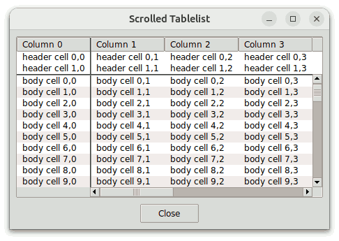
This example shows how you can greatly simplify the creation of a scrolled tablelist by using a scrollarea widget.
The script ScrolledTablelist1.tcl in the demos
directory creates a horizontally and vertically scrolled tablelist widget
having two header rows and one title column, and manages the two scrollbars
in such a way that the vertical scrollbar appears below the tablelist's
header and the horizontal one starts to the right of the widget's title
column area:
The script achieves these requirements using traditional scrollbar management, which is shown below in red color:
package require Tk 8.5-
package require tablelist_tile 6.3-
set dir [file dirname [info script]]
source [file join $dir styleUtil.tcl]

wm title . "Scrolled Tablelist"

#
# Create the tablelist and the scrollbars as children
# of a frame having -borderwidth 1 and -relief sunken
#
set f   [ttk::frame .f]
set frm [ttk::frame $f.frm -borderwidth 1 -relief sunken]
set tbl $frm.tbl
set vsb $frm.vsb
set hsb $frm.hsb
tablelist::tablelist $tbl ... -borderwidth 0 \
    -xscrollcommand [list $hsb set] -yscrollcommand [list $vsb set]
. . .
ttk::scrollbar $vsb -orient vertical   -command [list $tbl yview]
ttk::scrollbar $hsb -orient horizontal -command [list $tbl xview]

. . .

#
# Manage the widgets within the frame
#
grid $tbl -row 0 -rowspan 2 -column 0 -columnspan 2 -sticky news
if {[tk windowingsystem] eq "win32"} {
    grid $vsb -row 0 -rowspan 2 -column 2 -sticky ns
} else {
    grid [$tbl cornerpath] -row 0 -column 2 -sticky ew
    grid $vsb              -row 1 -column 2 -sticky ns
}
grid [$tbl cornerpath -sw] -row 2 -column 0 -sticky ns
grid $hsb                  -row 2 -column 1 -sticky ew
grid rowconfigure    $frm 1 -weight 1
grid columnconfigure $frm 1 -weight 1

. . .

#
# Manage the frame
#
pack $frm -expand yes -fill both -padx 9p -pady 9p
pack $f   -expand yes -fill both
The script ScrolledTablelist2.tcl in the demos
directory replaces the rather technical code above with just a few lines
(shown below in red color), by embedding the
tablelist into a scrollarea widget. It requires Tablelist version 6.5,
which is needed so the -respectheader and -respecttitlecolumns
scrollarea options can work as expected (for earlier Tablelist versions these
options are silently ignored). As a further benefit, the scrollbars
created with this method will have the default display mode
dynamic.
package require Tk 8.5-
package require tablelist_tile 6.5-
package require scrollutil_tile
set dir [file dirname [info script]]
source [file join $dir styleUtil.tcl]

wm title . "Scrolled Tablelist"

#
# Create the tablelist within a scrollarea
#
set f  [ttk::frame .f]
set sa [scrollutil::scrollarea $f.sa]
set tbl $sa.tbl
tablelist::tablelist $tbl ...
. . .
$sa setwidget $tbl

. . .

#
# Manage the scrollarea
#
pack $sa -expand yes -fill both -padx 9p -pady 9p
pack $f  -expand yes -fill both
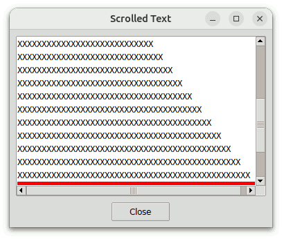
The script ScrolledText.tcl in the demos
directory shows how the scrollarea widget
circumvents the potential shimmering effect in connection with text
widgets.
Here is the relevant code, in which the lines related to the scrollarea widget are shown in red color:
package require scrollutil_tile
set dir [file dirname [info script]]
source [file join $dir styleUtil.tcl]

wm title . "Scrolled Text"

#
# Create a text widget within a scrollarea
#
set f  [ttk::frame .f]
set sa [scrollutil::scrollarea $f.sa -lockinterval 10]
set txt [text $sa.txt -font TkFixedFont -width 49 -height 12 \
         -spacing1 1.5p -spacing3 1.5p -wrap none]
$sa setwidget $txt

#
# Populate the text widget and set the background color of line #25 to red
#
for {set i 1} {$i <= 30} {incr i} {
    set j [expr {2*$i}]
    $txt insert end [string repeat x $j]\n
}
$txt delete 30.end
$txt tag configure bgRed -background red
$txt tag add bgRed 25.0 25.end

. . .

#
# Manage the scrollarea
#
pack $sa -expand yes -fill both -padx 9p -pady 9p
pack $f  -expand yes -fill both

#
# Adjust the vertical view in the text window
# so that line #25 becomes the bottom line
#
tkwait visibility $txt
after 100 [list $txt yview 14.0]
The script creates a text widget $txt embedded into a
scrollarea, populates it with 30 lines, and adjusts the vertical view in the
text window so that line #25 becomes the bottom line. This line has 50
characters, hence it doesn't fit completely into the window, whose width is
49 characters. Consequently, the command $txt
xview will return the list {0.0 0.98},
hence the scrollarea's horizontal scrollbar will be mapped and will obscure
most part of the bottom line. Since this line has red
background, it is easy to see how much of it sticks out above the upper edge
of the scrollbar.
Let's analyze what happens if the text widget's height is decreased by
dragging the main window's upper or lower edge, just until the red pixels get
obscured by the horizontal scrollbar. After performing this action,
line #25 is completely out of view and the new bottom line is line #24, which
has 48 characters, hence the command $txt xview will
return {0.0 1.0}. Normally, this would cause the
horizontal scrollbar to be unmapped. However, that would make line #25
to the bottom line, thus causing the horizontal scrollbar to be mapped
again. This time the scrollbar would completely obscure this line,
which would result in line #24 to become the bottom line, which would cause
the scrollbar to be unmapped again, and so on. In other words, the
horizontal scrollbar would get mapped and unmapped in an endless loop, giving
rise to an annoying flickering effect. The built-in locking mechanism
of the scrollarea widget guards against such potential endless loops.
To make sure that the locking will work as expected, we have set the
-lockinterval
scrollarea option to 10 (recall that the default value is
1).
The script ScrolledCanvas.tcl in the demos
directory shows how to use the Scrollutil package for adding scrollbars as
well as mouse wheel and <TouchpadScroll> event support to
a canvas widget. Further, it shows how to add mouse wheel and
<TouchpadScroll> event support to ttk::scale widgets.
Here is the relevant code, in which the lines related to the Scrollutil package are shown in red color:
package require scrollutil_tile
set dir [file dirname [info script]]
source [file join $dir styleUtil.tcl]

wm title . "Scrolled Canvas"

set scaleFactor [expr {[scrollutil::getScalingPct] / 100.0}]
set width  [expr {13 * 32 * $scaleFactor}]
set height [expr {10 * 32 * $scaleFactor}]
set scrlIncr [expr {16 * $scaleFactor}]

#
# Create a canvas widget within a scrollarea and add mouse wheel support to it
#
set f  [ttk::frame .f]
set sa [scrollutil::scrollarea $f.sa]
set c  [canvas $sa.c -background white -width $width -height $height \
        -xscrollincrement $scrlIncr -yscrollincrement $scrlIncr]
bind $c <Configure> { setScrollRegion %W %w %h }
scrollutil::addMouseWheelSupport $c
$sa setwidget $c

set rows 20
set cols 20

#
# Populate the canvas and then rescale the coordinates
# of all of the items by a factor of $scaleFactor
#
proc populate canv {
    $canv delete all
    global rows cols scaleFactor

    for {set row 0; set y 32} {$row < $rows} {incr row; incr y 96} {
        for {set col 0; set x 32} {$col < $cols} {incr col; incr x 96} {
            $canv create rectangle $x $y [expr {$x+63}] [expr {$y+63}] \
                -fill gray95
            $canv create text [expr {$x+32}] [expr {$y+32}] \
                -text "Box\n$row,$col" -anchor center -justify center
        }
    }

    $canv scale all 0 0 $scaleFactor $scaleFactor
}
populate $c

#
# Sets the scroll region of the canvas.
#
proc setScrollRegion {canv width height} {
    global cols rows scaleFactor
    set rightX [expr {($cols*96 + 32) * $scaleFactor}]
    set lowerY [expr {($rows*96 + 32) * $scaleFactor}]
    if {$rightX < $width}  { set rightX $width }
    if {$lowerY < $height} { set lowerY $height }
    $canv configure -scrollregion [list 0 0 $rightX $lowerY]
}

. . .

#
# Create a ttk::scale widget for setting the number of box rows
#
set fRows [ttk::frame $f.fRows]
pack [ttk::label $fRows.l1 -text "Rows:"] -side left -padx {0 3p}
pack [ttk::label $fRows.l2 -textvariable rows] -side left -padx {0 3p}
pack [ttk::scale $fRows.scl -from 5 -to 50 -value $rows -command \
      [list setBoxRows $fRows.scl]] -side left -expand yes -fill x

proc setBoxRows {scl val} {
    global rows c
    set val [expr {round($val)}]
    if {$val != $rows} {
        set rows $val
        populate $c
        setScrollRegion $c [winfo width $c] [winfo height $c]
    }
}

#
# Create a ttk::scale widget for setting the number of box columns
#

. . .

#
# Add mouse wheel support to the ttk::scale widgets
#
scrollutil::addMouseWheelSupport TScale

. . .
The script creates a canvas widget, populates it with
rectangle and text items, and adds mouse wheel and
<TouchpadScroll> event support to it by passing its name
to the scrollutil::addMouseWheelSupport
command. Note that in the canvas we work with pixels rather than
points, but make the GUI fully scaling-aware with the aid of a variable
scaleFactor, whose value (1.0, 1.25,
1.5, etc.) is derived from
[scrollutil::getScalingPct].
The script also creates two ttk::scale widgets, used for setting the
numbers of box rows and columns in the canvas, and adds mouse wheel and
<TouchpadScroll> event support to the ttk::scale widgets
by passing the widget class TScale to the
scrollutil::addMouseWheelSupport command.
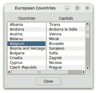
The script SyncListboxes.tcl in the demos
directory creates two listboxes within a scrollsync widget, which in turn is embedded into a
scrollarea.
Here is the relevant code, in which the lines related to the scrollarea and scrollsync widgets are shown in red color:
package require scrollutil_tile
set dir [file dirname [info script]]
source [file join $dir styleUtil.tcl]

wm title . "European Countries"

. . .

set f  [ttk::frame .f]

. . .

#
# Create a scrollsync widget within a scrollarea
#
set sa [scrollutil::scrollarea $f.sa]
set ss [scrollutil::scrollsync $sa.ss]
$sa setwidget $ss

#
# Populate the scrollsync widget with two listboxes
#

. . .

set lb1 [listbox $ss.lb1 -activestyle none -highlightthickness 0 -width 16]
set lb2 [listbox $ss.lb2 -activestyle none -highlightthickness 0 -width 16]
$ss setwidgets [list $lb1 $lb2]

. . .

grid $lb1 $lb2 -sticky news -padx {0 1.5p}
grid rowconfigure    $ss 0 -weight 1
grid columnconfigure $ss 0 -weight 1
grid columnconfigure $ss 1 -weight 1

. . .

pack $sa -side top -expand yes -fill both -padx 9p -pady {1.5p 9p}
pack $f  -expand yes -fill both

. . .
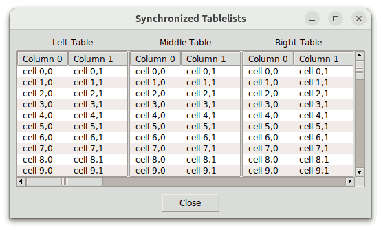
The script SyncTablelists.tcl in the demos
directory creates three tablelists within a scrollsync widget, which in turn is embedded into a
scrollarea.
The relevant code is similar to the one shown in the previous example:
package require tablelist_tile
package require scrollutil_tile
set dir [file dirname [info script]]
source [file join $dir styleUtil.tcl]

wm title . "Synchronized Tablelists"

. . .

set f  [ttk::frame .f]

. . .

#
# Create a scrollsync widget within a scrollarea
#
set sa [scrollutil::scrollarea $f.sa]
set ss [scrollutil::scrollsync $sa.ss]
$sa setwidget $ss

#
# Populate the scrollsync widget with three tablelists
#

tablelist::setThemeDefaults
if {$tablelist::themeDefaults(-stripebackground) eq ""} {
    option add *Tablelist.background            white
    option add *Tablelist.stripeBackground      #f0f0f0
}

for {set n 1; set colWidth 40} {$n <= 3} {incr n; incr colWidth 20} {
    set tbl [tablelist::tablelist $ss.tbl$n \
             -columns [list 0 "Column 0" left  $colWidth "Column 1" left]]
    set tbl$n $tbl

    for {set i 0} {$i < 40} {incr i} {
        $tbl insert end [list "cell $i,0" "cell $i,1"]
    }
}
$ss setwidgets [list $tbl1 $tbl2 $tbl3]

grid $tbl1 $tbl2 $tbl3 -sticky news -padx {0 1.5p}
grid rowconfigure    $ss 0 -weight 1
grid columnconfigure $ss 0 -weight 1
grid columnconfigure $ss 1 -weight 1
grid columnconfigure $ss 2 -weight 1

. . .

pack $sa -side top -expand yes -fill both -padx 9p -pady {1.5p 9p}
pack $f  -expand yes -fill both

. . .
The option database settings above for the -background and
-stripebackground tablelist configuration options are not
present in case of the aqua theme, because for this theme the
default values of these options are not only aqua-specific, but
in addition on Mac OS 10.14 (Mojave) and later they also depend on the
current system appearance (Light Mode or Dark Mode).
Notice that column #1 of the three tablelist widgets is 40, 60, and 80 characters wide, respectively. For this reason, when scrolling horizontally to the right, the left table's view will reach its horizontal end position first, then that of the midde table, and as last one the view of the right table.
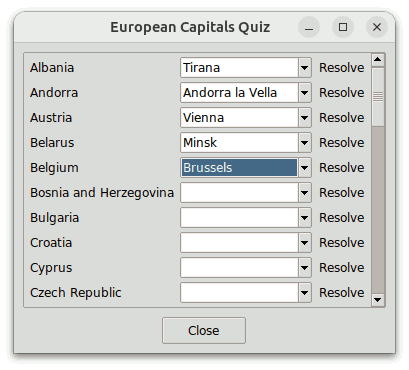
The script SuScrollableFrmDemo1.tcl in the demos
directory creates a scrollutil::scrollableframe widget embedded into a
scrollarea and creates mouse wheel and
<TouchpadScroll> event bindings for the binding tag
"all" with the aid of the scrollutil::createWheelEventBindings
command. Recall that the scrollableframe was automatically registered
for scrolling by these bindings at creation time, hence there is no need to
invoke the scrollutil::enableScrollingByWheel
command for it again. After that, the script populates the content
frame of the scrollableframe with ttk::label widgets displaying the names of
the European countries, ttk::combobox widgets for selecting the corresponding
capital cities, and ttk::button widgets of the style
Small.Toolbutton (created by using the procedure
styleutil::createToolbutton, implemented in the file
styleUtil.tcl) for the less patient
users, displaying the text "Resolve".
Here is the relevant code:
package require scrollutil_tile
set dir [file dirname [info script]]
source [file join $dir styleUtil.tcl]

wm title . "European Capitals Quiz"

#
# Create a scrollableframe within a scrollarea
#
set f  [ttk::frame .f]
set sa [scrollutil::scrollarea $f.sa]
set sf [scrollutil::scrollableframe $sa.sf]
$sa setwidget $sf

#
# Create mouse wheel event bindings for the binding tag "all"
#
scrollutil::createWheelEventBindings all

#
# Get the content frame and populate it
#

set cf [$sf contentframe]

set countryList {
    Albania Andorra Austria Belarus Belgium "Bosnia and Herzegovina" Bulgaria
    . . .
}
set capitalList {
    Tirana "Andorra la Vella" Vienna Minsk Brussels Sarajevo Sofia
    . . .
}

. . .

set capitalList [lsort $capitalList]

. . .

set row 0
foreach country $countryList {
    . . .

    set w [ttk::combobox $cf.cb$row -state readonly -width 14 \
           -values $capitalList]
    . . .

    #
    # Make the keyboard navigation more user-friendly
    #
    bind $w <<TraverseIn>> [list $sf see %W]

    #
    # Adapt the handling of the mouse wheel and mouse
    # button 2 events for the ttk::combobox widget
    #
    scrollutil::adaptWheelEventHandling $w
    scrollutil::adaptBtn2EventHandling $w

    . . .

    incr row
}

. . .
We make the keyboard navigation more user-friendly with the aid of the
see subcommand of the
scrollableframe widget when handling the
<<TraverseIn>> virtual event for the ttk::combobox
and (not shown above) ttk::button widgets. In addition, we invoke the
scrollutil::adaptWheelEventHandling
command for every ttk::combobox widget, which is needed for a user-friendly
event handling, being that this widget has built-in bindings for the mouse
wheel and <TouchpadScroll> events. Due to this
command, these events over one of the ttk::combobox widgets will only select
the next/previous capital city if the widget has the focus, otherwise they
will scroll the scrollableframe.
For every ttk::combobox widget, we also invoke the scrollutil::adaptBtn2EventHandling
command, thus making sure that the mouse button 2 events sent to the widget
will only be handled by the widget itself if it has the focus, otherwise they
will result in scanning the scrollableframe's content. During the scan
the cursor will take on the shape of a pointing hand, and by draggging the
mouse, the content frame will drag at high speed through the window, in the
direction the mouse moves.
The script BwScrollableFrmDemo1.tcl in the demos
directory creates a BWidget ScrollableFrame embedded into a scrollarea widget, creates mouse wheel and
<TouchpadScroll> event bindings for the binding tag
"all" with the aid of the scrollutil::createWheelEventBindings
command, and invokes the scrollutil::enableScrollingByWheel
command for this ScrollableFrame, thus registering the latter for scrolling
by these bindings. After that it populates the content frame of the
ScrollableFrame with the same widgets as
SuScrollableFrmDemo1.tcl in the previous example.
Here is the relevant code:
package require BWidget
Widget::theme yes
package require scrollutil_tile
set dir [file dirname [info script]]
source [file join $dir styleUtil.tcl]

wm title . "European Capitals Quiz"

#
# Create a ScrollableFrame within a scrollarea
#
set f  [ttk::frame .f]
set sa [scrollutil::scrollarea $f.sa]
set sf [ScrollableFrame $sa.sf]
$sa setwidget $sf

. . .

#
# Create mouse wheel event bindings for the binding tag "all" and
# register the ScrollableFrame for scrolling by these bindings
#
scrollutil::createWheelEventBindings all
scrollutil::enableScrollingByWheel $sf

#
# Get the content frame and populate it
#

set cf [$sf getframe]

set countryList {
    Albania Andorra Austria Belarus Belgium "Bosnia and Herzegovina" Bulgaria
    . . .
}
set capitalList {
    Tirana "Andorra la Vella" Vienna Minsk Brussels Sarajevo Sofia
    . . .
}

. . .

set capitalList [lsort $capitalList]

. . .

set row 0
foreach country $countryList {
    . . .

    set w [ttk::combobox $cf.cb$row -state readonly -width 14 \
           -values $capitalList]
    . . .

    #
    # Make the keyboard navigation more user-friendly
    #
    bind $w <<TraverseIn>> [list $sf see %W]

    #
    # Adapt the handling of the mouse wheel events for the ttk::combobox widget
    #
    scrollutil::adaptWheelEventHandling $w

    . . .

    incr row
}

. . .
The script ScrolledFrmDemo1.tcl in the demos
directory creates an iwidgets::scrolledframe widget, creates mouse wheel and
<TouchpadScroll> event bindings for the binding tag
"all" with the aid of the scrollutil::createWheelEventBindings
command, and invokes the scrollutil::enableScrollingByWheel
command for this scrolledframe, thus registering the latter for scrolling by
these bindings. After that it populates the content frame of the
scrolledframe with the same widgets as SuScrollableFrmDemo1.tcl
and BwScrollableFrmDemo1.tcl in the two previous examples.
Here is the relevant code:
if {[catch {package require iwidgets} result1] != 0 &&
    [catch {package require Iwidgets} result2] != 0} {
    error "$result1; $result2"
}
set dir [file dirname [info script]]
source [file join $dir scrolledwidgetPatch.itk] ;# adds ttk::scrollbar widgets
package require scrollutil_tile
source [file join $dir styleUtil.tcl]

wm title . "European Capitals Quiz"

. . .

#
# Create a scrolledframe
#
set f  [ttk::frame .f]
set sf [iwidgets::scrolledframe $f.sf -borderwidth 1 -relief sunken \
        -scrollmargin 0]
. . .

#
# Create mouse wheel event bindings for the binding tag "all"
# and register the scrolledframe for scrolling by these bindings
#
scrollutil::createWheelEventBindings all
scrollutil::enableScrollingByWheel $sf

#
# Get the content frame and populate it
#

set cf [$sf childsite]
. . .

<exactly as in the previous example, except the stuff related to keyboard navigation>

. . .
The code related to keyboard navigation is not present in this example,
because the iwidgets::scrolledframe widget doesn't provide a see
subcommand.
The script SuScrollableFrmDemo2.tcl in the demos
directory creates a scrollutil::scrollableframe widget embedded into a
scrollarea and then sources the
script SuScrollableFrmContent.tcl, which populates the content
frame of the scrollableframe with the following widgets:
$txt within a scrollarea;$lb within a scrollarea;$cb;$sb;$e;$me of type "Date";$tbl within a scrollarea;$tv within a
scrollarea.With the exception of ttk::label and ttk::separator, all these widgets
have bult-in mouse wheel and <TouchpadScroll> event
bindings. And with the exception of ttk::label, ttk::separator, and
ttk::treeview, all these widgets have bult-in mouse button 2 event
bindings.
Here is the relevant code:
package require Tk 8.5.9-                       ;# for ttk::spinbox
package require mentry_tile 3.2-                ;# for mouse wheel support
package require tablelist_tile 6.5-             ;# for -(x|y)mousewheelwindow
                                                ;# and scrollutil::scrollarea
package require scrollutil_tile
set dir [file dirname [info script]]
source [file join $dir styleUtil.tcl]

wm title . "Scrollutil Demo"

#
# Create a scrollableframe within a scrollarea
#
set tf [ttk::frame .tf]
set sa [scrollutil::scrollarea $tf.sa]
set sf [scrollutil::scrollableframe $sa.sf]
$sa setwidget $sf

#
# Get the content frame and populate it
#
set cf [$sf contentframe]
source [file join $dir SuScrollableFrmContent.tcl]

#
# Make the keyboard navigation more user-friendly
#
foreach w [list $cb $sb $e $me] {
    bind $w <<TraverseIn>> [list $sf see %W]
}
foreach w [list $txt $lb $tbl $tv] {
    bind $w <<TraverseIn>> [list seeScrollarea $sf %W]
}
proc seeScrollarea {sf w} { $sf see [scrollutil::getscrollarea $w] }
Whenever the <<TraverseIn>> virtual event is sent
to one of the four widgets created within scrollareas, we query the path name
of the corresponding scrollarea via scrollutil::getscrollarea and
bring that scrollarea (including the scrollbars and the border) into view
rather than just the widget in question. While in this script we
could have used [winfo parent] instead, the command
scrollutil::getscrollarea is the recommended one, being that it
works also for widgets that are no children of the corresponding
scrollareas.
Here is the additional stuff related to the mouse wheel and
<TouchpadScroll> events, using the Scrollutil commands
described in the What Is Scrollutil? section:
#
# For the entry components of the mentry widget
# set the "focus check window" to the mentry
#
set entryList [$me entries]
scrollutil::setFocusCheckWindow {*}$entryList $me

#
# Create mouse wheel event bindings for the binding tag "all"
#
scrollutil::createWheelEventBindings all

#
# Adapt the handling of the mouse wheel events for the
# text, listbox, ttk::combobox, ttk::spinbox, ttk::entry,
# tablelist, and ttk::treeview widgets, as well as for
# the entry components of the mentry widget of type "Date"
#
### scrollutil::adaptWheelEventHandling $txt $lb $cb $sb $e {*}$entryList \
    $tbl $tv
$sf preparescroll
Notice that the invocation of the scrollutil::adaptWheelEventHandling
command is commented out and replaced with the much simpler and safer
invocation of the preparescroll scrollableframe
subcommand.
We also have additional stuff related to the mouse button 2 events:
#
# Adapt the handling of the mouse button 2 events for the text, listbox,
# ttk::combobox, ttk::spinbox, ttk::entry, and tablelist widgets, as
# well as for the entry components of the mentry widget of type "Date"
#
### scrollutil::adaptBtn2EventHandling $txt $lb $cb $sb $e {*}$entryList $tbl
$sf preparescan
Again, the invocation of the scrollutil::adaptBtn2EventHandling
command is commented out and replaced with the much simpler and safer
invocation of the preparescan scrollableframe
subcommand.
As already mentioned, in the file SuScrollableFrmContent.tcl
the scrolled text, listbox, tablelist, and ttk::treeview widgets are created
within scrollarea widgets:
set _sa [scrollutil::scrollarea ...]
set txt [text $_sa.txt -font TkFixedFont -width 73]
scrollutil::addMouseWheelSupport $txt
$_sa setwidget $txt
grid $_sa ...

. . .

set _sa [scrollutil::scrollarea ...]
set lb [listbox $_sa.lb -width 0]
$_sa setwidget $lb
grid $_sa ...

. . .

set _sa [scrollutil::scrollarea ...]
set tbl [tablelist::tablelist $_sa.tbl ...]
. . .
$_sa setwidget $tbl
grid $_sa ...

. . .

set _sa [scrollutil::scrollarea ... -borderwidth 0]
set tv [ttk::treeview $_sa.tv ...]
. . .
$_sa setwidget $tv
grid $_sa ...
In the case of the text, listbox, and tablelist widgets we use scrollarea
widgets with their default -borderwidth 1 -relief
sunken settings, which will cause the setwidget subcommand of the associated
Tcl commands to set the -borderwidth option of the text,
listbox, and tablelist widgets to 0. On the other hand,
for the ttk::treeview we use a scrollarea widget with
-borderwidth 0, because the ttk::treeview has a border of
width 1 and doesn't support the -borderwidth
configuration option.
For our text widget we prefer a mouse wheel and
<TouchpadScroll> event handling that scrolls the widget by
lines rather than pixels, as done by the Text class bindings in
Tk 8.5 and later; we achieve this by passing the path name $txt
to the scrollutil::addMouseWheelSupport
command.
The somewhat uncommon look of the ttk::spinbox widget $sb
displaying the number of changes in a Tablelist release is due to the fact
that in the file SuScrollableFrmContent.tcl it is created with
the -style option set to Wide.TSpinbox rather than
TSpinbox:
catch {package require wsb}

. . .

set sb [ttk::spinbox $cf.sb -style Wide.TSpinbox -from 0 -to 20 \
        -state readonly -width 4]
The small wide spinbox package wsb comes bundled with
the Scrollutil distribution, and the attempt to load it via
package require wsb will be successful if the Tk version
is either at least 8.7 (with built-in SVG support), or 8.6 and the tksvg
extension can be loaded into the interpreter. If loaded, the wsb
package will automatically create the Wide.TSpinbox
layout. Otherwise the -style Wide.TSpinbox
setting for the ttk::spinbox widget will have no effect.
The main benefit of the Wide.TSpinbox layout over the
TSpinbox style is the user-friendly size and placement of its
scaling-aware up and down arrows, which comes in handy especially when
running AndroWish on a tablet or smartphone:
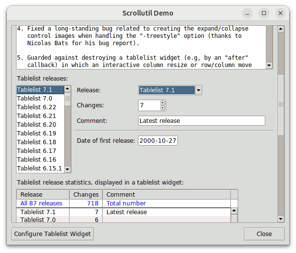
The file SuScrollableFrmContent.tcl implements just a minimal
interaction between five of the already mentioned widgets within the content
frame: By selecting a Tablelist release from the ttk::combobox
$cb, the ttk::spinbox $sb is set to the
corresponding number of changes, the comment associated with that release is
inserted into the ttk::entry $e, and the corresponding items of
the tablelist $tbl and ttk::treeview $tv are
selected and brought into view.
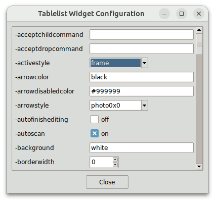
The file SuScrollableFrmContent.tcl contains also the
implementation of the procedure configTablelist, associated with
the "Configure Tablelist Widget" button as the value of its
-command option. This procedure opens a toplevel window
that contains a scrollutil::scrollableframe widget created with
the -fitcontentwidth yes
setting within a scrollarea. After that
it populates the content frame of the scrollableframe with ttk::label,
ttk::combobox, ttk::spinbox, ttk::entry, and ttk::checkbutton or
toggleswitch widgets used to display and edit the configuration options of
the tablelist widget. If the ttk::toggleswitch widget is available (it
was added to the core in Tk 9.1a1) then we use this widget rather than
checkbuttons; else if the toggle switch widget package Tsw can be loaded into
the interpreter then we use tsw::toggleswitch widgets instead. The
ttk::spinbox widgets are created with the setting -style
Wide.TSpinbox.
The procedure handles the <<TraverseIn>> virtual
event sent to one of the widgets mentioned above with the aid of the
scrollableframe's see
subcommand. Whenever a ttk::combobox, ttk::spinbox, or ttk::entry is
created, the scrollutil::adaptWheelEventHandling
command is invoked for it, being that these widgets have their own bindings
for the mouse wheel and <TouchpadScroll> events.
Similarly, we pass the ttk::combobox, ttk::spinbox, and ttk::entry widgets
to the scrollutil::adaptBtn2EventHandling
command, because these widgets have built-in bindings for the mouse button 2
events.
The widgets populating the content frame are managed using
grid. In case of the ttk::entry widgets we invoke
grid with -sticky we. Due to this and
the -fitcontentwidth yes scrollableframe setting,
the ttk::entry widgets will stretch or shrink whenever the width of the
scrollableframe changes as a result of resizing the toplevel window.
The script BwScrollableFrmDemo2.tcl in the demos
directory creates a BWidget ScrollableFrame embedded into a scrollarea widget and then sources the
script BwScrollableFrmContent.tcl, which populates the content
frame of the ScrollableFrame with the same widgets as
SuScrollableFrmContent.tcl in the previous example.
Here is the relevant code:
package require Tk 8.5.9- ;# for ttk::spinbox package require BWidget Widget::theme yes package require mentry_tile 3.2- ;# for mouse wheel support package require tablelist_tile 6.5- ;# for -(x|y)mousewheelwindow ;# and scrollutil::scrollarea package require scrollutil_tile set dir [file dirname [info script]] source [file join $dir styleUtil.tcl] wm title . "Scrollutil Demo" # # Create a ScrollableFrame within a scrollarea # set tf [ttk::frame .tf] set sa [scrollutil::scrollarea $tf.sa] set sf [ScrollableFrame $sa.sf] $sa setwidget $sf . . . # # Get the content frame and populate it # set cf [$sf getframe] source [file join $dir BwScrollableFrmContent.tcl] # # Make the keyboard navigation more user-friendly # foreach w [list $cb $sb $e $me] { bind $w <<TraverseIn>> [list $sf see %W] } foreach w [list $txt $lb $tbl $tv] { bind $w <<TraverseIn>> [list seeScrollarea $sf %W] } proc seeScrollarea {sf w} { $sf see [scrollutil::getscrollarea $w] }
The additional stuff related to the mouse wheel and
<TouchpadScroll> events contains the same Scrollutil
command invocations as the one in the previous example, except that in
addition it registers the ScrollableFrame for scrolling with the mouse wheel
and touchpad, and invokes the scrollutil::prepareScrollingByWheel
command:
. . . # # Create mouse wheel event bindings for the binding tag "all" and # register the ScrollableFrame for scrolling by these bindings # scrollutil::createWheelEventBindings all scrollutil::enableScrollingByWheel $sf # # Adapt the handling of the mouse wheel events for the # text, listbox, ttk::combobox, ttk::spinbox, ttk::entry, # tablelist, and ttk::treeview widgets, as well as for # the entry components of the mentry widget of type "Date" # ### scrollutil::adaptWheelEventHandling $txt $lb $cb $sb $e {*}$entryList \ $tbl $tv scrollutil::prepareScrollingByWheel $sf
The file BwScrollableFrmContent.tcl contains also the
implementation of the procedure configTablelist, associated with
the "Configure Tablelist Widget" button as the value of its
-command option. This procedure opens a toplevel window
that contains a BWidget ScrollableFrame created with the
-constrainedwidth yes setting within a scrollarea widget and invokes the scrollutil::enableScrollingByWheel
command for this ScrollableFrame, thus registering the latter for scrolling
by the already created mouse wheel and <TouchpadScroll>
event bindings for the binding tag "all". After that it
populates the content frame of the ScrollableFrame with ttk::label,
ttk::combobox, ttk::spinbox, ttk::entry, and ttk::checkbutton or toggleswitch
widgets used to display and edit the configuration options of the tablelist
widget. The ttk::spinbox widgets are created with the setting
-style
  Wide.TSpinbox
.
The procedure handles the <<TraverseIn>> virtual
event sent to one of these widgets with the aid of the ScrollableFrame's
see subcommand. Whenever a ttk::combobox, ttk::spinbox,
or ttk::entry is created, the scrollutil::adaptWheelEventHandling
command is invoked for it, being that these widgets have their own bindings
for the mouse wheel and <TouchpadScroll> events.
Again, all this is nearly identical to what we did in the previous example.
The script ScrolledFrmDemo2.tcl in the demos
directory creates an iwidgets::scrolledframe widget and then
sources the file ScrolledFrmContent.tcl, which
populates the content frame of the scrolledframe with the same widgets as
SuScrollableFrmContent.tcl and
BwScrollableFrmContent.tcl in the two previous examples.
Here is the relevant code:
package require Tk 8.5.9-                       ;# for ttk::spinbox
if {[catch {package require iwidgets} result1] != 0 &&
    [catch {package require Iwidgets} result2] != 0} {
    error "$result1; $result2"
}
set dir [file dirname [info script]]
source [file join $dir scrolledwidgetPatch.itk] ;# adds ttk::scrollbar widgets
package require mentry_tile 3.2-                ;# for mouse wheel support
package require tablelist_tile 6.5-             ;# for -(x|y)mousewheelwindow
                                                ;# and scrollutil::scrollarea
package require scrollutil_tile
source [file join $dir styleUtil.tcl]

wm title . "Scrollutil Demo"

. . .

#
# Create a scrolledframe
#
set tf [ttk::frame .tf]
set sf [iwidgets::scrolledframe $tf.sf -borderwidth 1 -relief sunken \
        -scrollmargin 0]
. . .

#
# Get the content frame and populate it
#
set cf [$sf childsite]
. . .
source [file join $dir ScrolledFrmContent.tcl]
The additional stuff related to the mouse wheel and
<TouchpadScroll> events contains the same Scrollutil
command invocations as the one in the previous example.
The file ScrolledFrmContent.tcl contains also the
implementation of the procedure configTablelist, associated with
the "Configure Tablelist Widget" button as the value of its
-command option. This procedure opens a toplevel window
that contains an iwidgets::scrolledframe widget with a manually implemented
equivalent of the -fitcontentwidth yes
scrollutil::scrollableframe and
-constrainedwidth yes BWidget ScrollableFrame settings and
invokes the scrollutil::enableScrollingByWheel
command for this scrolledframe, thus registering the latter for scrolling by
the already created mouse wheel and
<TouchpadScroll> event bindings for the binding tag
"all". After that it populates the content frame of the
scrolledframe with ttk::label, ttk::combobox, ttk::spinbox, ttk::entry, and
ttk::checkbutton or toggleswitch widgets used to display and edit the
configuration options of the tablelist widget. The ttk::spinbox widgets
are created with the setting -style Wide.TSpinbox.
Whenever a ttk::combobox, ttk::spinbox, or ttk::entry is created, the
scrollutil::adaptWheelEventHandling
command is invoked for it, being that these widgets have their own bindings
for the mouse wheel and <TouchpadScroll>
events.
Again, all this is nearly identical to what we did in the two previous examples.
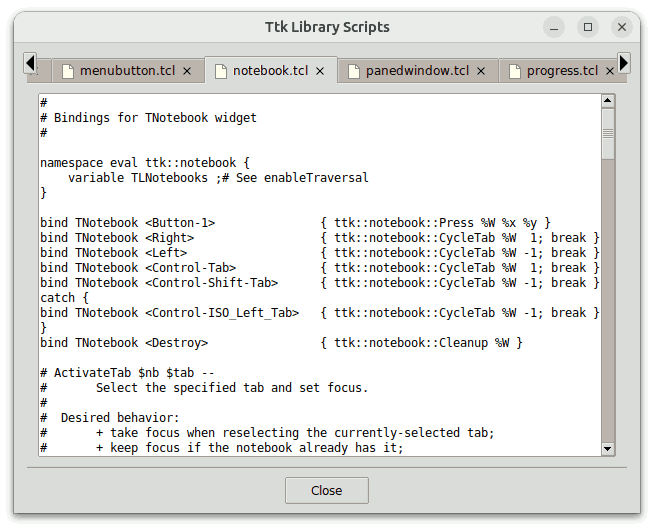
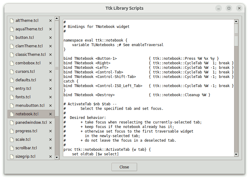
The script ScrolledNotebookDemo.tcl in the demos
directory creates a scrollutil::scrollednotebook widget and populates
it with panes containing scrollareas that wrap
text widgets displaying the contents of the Ttk library files. After
that it provides pop-up menu items for left/right moving and closing the
panes, and sets the height and width of the scrollednotebook to values
computed from the requested height and width of the scrollarea widgets and
the padding applied to the panes.
Here is the relevant code:
package require scrollutil_tile
set dir [file dirname [info script]]
source [file join $dir styleUtil.tcl]

wm title . "Ttk Library Scripts"

scrollutil::addclosetab My.TNotebook

#
# Create an image corresponding to the display's DPI scaling level
#
if {$tk_version >= 8.7 || [catch {package require tksvg}] == 0} {
    set fmt $scrollutil::svgfmt
    image create photo fileImg -file [file join $dir file.svg] -format $fmt
} else {
    set pct $scrollutil::scalingpct
    image create photo fileImg -file [file join $dir file$pct.gif] -format gif
}

#
# Create a scrollednotebook widget having closable (and, per default,
# movable) tabs and populate it with panes that contain scrolled
# text widgets displaying the contents of the Ttk library files
#
set f  [ttk::frame .f]
set nb [scrollutil::scrollednotebook $f.nb -style My.TNotebook \
        -forgetcommand condCopySel -leavecommand saveSel]
set currentTheme [styleutil::getCurrentTheme]
set panePadding [expr {$currentTheme eq "aqua" ? 0 : "9p"}]
cd [expr {[info exists ttk::library] ? $ttk::library : $tile::library}]
foreach fileName [lsort [glob *.tcl]] {
    set baseName [string range $fileName 0 end-4]
    set sa [scrollutil::scrollarea $nb.sa_$baseName -lockinterval 10]
    $sa configure -yscrollbarmode static        ;# temporarily, for adjustsize
    if {$currentTheme eq "vista"} {
        $sa configure -relief solid
    }
    set txt [text $sa.txt -font TkFixedFont -takefocus 1 -wrap none]
    catch {$txt configure -tabstyle wordprocessor}      ;# for Tk 8.5 and later
    scrollutil::addMouseWheelSupport $txt       ;# old-school wheel support
    $sa setwidget $txt

    set chan [open $fileName]
    $txt insert end [read -nonewline $chan]
    close $chan
    $txt configure -state disabled
    bind $txt <Button-1> { focus %W }   ;# for Tk versions < 8.6.11/8.7a4

    $nb add $sa -text $fileName -image fileImg -compound left \
                -padding $panePadding
}

proc condCopySel {nb widget} {
    set txt $widget.txt
    if {[llength [$txt tag nextrange sel 1.0 end]] == 0} {
        return 1
    }

    set btn [tk_messageBox -title "Copy Selection?" -icon question \
             -message "Do you want to copy the selection to the clipboard?" \
             -type yesnocancel]
    switch $btn {
        yes     { tk_textCopy $txt; return 1 }
        no      { return 1 }
        cancel  { return 0 }
    }
}

proc saveSel {nb widget} {
    set selRange [$widget.txt tag nextrange sel 1.0 end]
    if {[llength $selRange] == 0} {
        $nb unsettabattrib $widget "selRange"
    } else {
        $nb tabattrib $widget "selRange" $selRange
    }

    return 1
}

#
# Create bindings for moving and closing the tabs interactively,
# as well as for the virtual event <<NotebookTabChanged>>
#
bind $nb <<MenuItemsRequested>> { populateMenu %W %d }
bind $nb <<NotebookTabChanged>> { restoreSel %W }

proc populateMenu {nb data} {
    foreach {menu tabIdx} $data {}
    set tabCount [$nb index end]
    set prevIdx [expr {($tabIdx - 1) % $tabCount}]
    set nextIdx [expr {($tabIdx + 1) % $tabCount}]
    set widget [lindex [$nb tabs] $tabIdx]

    $menu add command -label "Move Tab Left"  -command \
        [list $nb insert $prevIdx $widget]
    $menu add command -label "Move Tab Right" -command \
        [list $nb insert $nextIdx $widget]
    $menu add separator
    $menu add command -label "Close Tab" -command \
        [list $nb forget $tabIdx]
}

proc restoreSel nb {
    set widget [$nb select]
    if {$widget ne "" && [$nb hastabattrib $widget "selRange"]} {
        set txt $widget.txt
        $txt tag remove sel 1.0 end
        $txt tag add sel {*}[$nb tabattrib $widget "selRange"]
    }
}

. . .

#
# Set the scrollednotebook's -height and -width options to the
# maximum requested height and width of all panes, respectively
#
after 50 [list resizeNb $nb]

proc resizeNb nb {
    $nb adjustsize
    foreach sa [$nb tabs] {
        $sa configure -yscrollbarmode dynamic                   ;# the default
    }
}
We add the closetab element to the tabs of
the My.TNotebook style with the aid of the scrollutil::addclosetab
command, and create a scrollednotebook widget of this style. Note that,
while in this example we could have used the default ttk::notebook style
TNotebook instead, working with different ttk::notebook styles
is necessary in applications having both notebooks with the
closetab element in their tabs and notebooks without this
element.
If the Tk version is at least 8.7 or the tksvg package can be loaded into
the interpreter, then the image fileImg is created from the file
file.svg, using the public variable
scrollutil::svgfmt. Otherwise it is created from files
whose names contain the display's DPI scaling percentage, given by the public
variable scrollutil::scalingpct. The file
file100.gif contains an image of size 16 x 16, the file
file125.gif contains an image of size 20 x 20, the file
file150.gif contains an image of size 24 x 24, and so on.
In the first case a single file.svg file is needed and the image
will be scaled automatically, according to the display's real scaling
percentage, which can be greater than the maximum value 200 of
the variable scrollutil::scalingpct. This benefit comes in
handy especially when running AndroWish on a tablet or smartphone. In
the second case a total number of 5 file*.gif (or
file*.png) files are needed to make sure that the size of the
image will correspond to the value of the variable
scrollutil::scalingpct.
We set the -yscrollbarmode option of the
scrollarea widgets that we add to the scrollednotebook to
static, to make sure that the vertical scrollbars are visible
when the widget's adjustsize subcommand is called
to set its dimensions. After invoking this subcommand (towards the end
of the script), we restore the default value dynamic.
Note that the state of the text widgets is set to disabled,
but the user can select a text range and then copy the selection into the
clipboard via Control-c (Command-c on Mac OS
X/11+). When attempting to close a tab, the path name of the
corresponding scrollarea widget is automatically passed to the
condCopySel procedure, which was specified as the value of the
-forgetcommand
option. This procedure checks the text widget child of the scrollarea
for the existence of a selection and enables the user to make sure that the
selection will be copied to the clipboard before closing the tab, or to
cancel the attempted operation on it. In a real-world application, the
procedure specified as the value of the above-mentioned option would
typically ask the user whether to save the changes before closing the tab, or
to cancel the attempted operation on it.
When attempting to leave the currently selected window by selecting a
different one, the path name of the scrollarea widget is automatically passed
to the saveSel procedure, which was specified as the value of
the -leavecommand option.
This procedure saves the two-element list of text indices delimiting the
selection in the text widget child of the scrollarea as the value of the
"selRange" tab attribute, with the aid of the tabattrib subcommand, or resets
that tab attribute via unsettabattrib if the text
widget has no selection. Later, when this tab is selected again, the
restoreSel procedure, bound to the virtual event <<NotebookTabChanged>>,
checks the existence of the "selRange" tab attribute with the
aid of the hastabattrib subcommand and
restores the text widget selection specified by the value of this tab
attribute, retrieved with the aid of the tabattrib
subcommand. We chose this approach for saving and restoring the text
selection instead of creating the text widgets with
-exportselection 0 in order to demostrate the usage of
the subcommands related to tab attributes.
We also make use of the virtual event <<MenuItemsRequested>>
to populate the pop-up menu shown when the user clicks a tab with mouse
button 3.
When running the script, the scrollednotebook widget appears with the
configured width and tabs displaying the unstripped file names. For
comparison: The very similar script TtkNotebookDemo.tcl in
the demos directory creates a ttk::notebook widget and populates
it in the same way as the script ScrolledNotebookDemo.tcl
discussed above. Although the script also sets the notebook's
-width option to a value corresponding to the requested width of
the scrollarea widgets and the padding applied to the panes, the
ttk::notebook appears with an exorbitantly large width and (on most displays)
with squeezed tabs. If you resize it to a reasonable width, its tabs
become so small that their texts are no longer readable.
The script PlainNotebookDemo.tcl in the demos
directory creates a scrollutil::plainnotebook widget and populates
it with panes containing scrollareas that wrap
text widgets displaying the contents of the Ttk library files. After
that it provides pop-up menu items for moving the tabs upward/downward and
closing them.
The relevant code is nearly identical to the one shown in the previous example, except that here we make the
tabs closable by using the -closabletabs plainnotebook
option and the widget's width is set automatically to fit that of its
panes:
package require scrollutil_tile
set dir [file dirname [info script]]
source [file join $dir styleUtil.tcl]

wm title . "Ttk Library Scripts"

#
# Create an image corresponding to the display's DPI scaling level
#
. . .

#
# Create a plainnotebook widget having closable (and, per default,
# movable) tabs and populate it with panes that contain scrolled
# text widgets displaying the contents of the Ttk library files
#
set f  [ttk::frame .f]
set nb [scrollutil::plainnotebook $f.nb -closabletabs 1 \
        -forgetcommand condCopySel -leavecommand saveSel]
. . .

proc condCopySel {nb widget} {
    . . .
}

proc saveSel {nb widget} {
    . . .
}

#
# Create bindings for moving and closing the tabs interactively,
# as well as for the virtual event <<NotebookTabChanged>>
#
bind $nb <<MenuItemsRequested>> { populateMenu %W %d }
bind $nb <<NotebookTabChanged>> { restoreSel %W }

proc populateMenu {nb data} {
    . . .
}

proc restoreSel nb {
    . . .
}

. . .
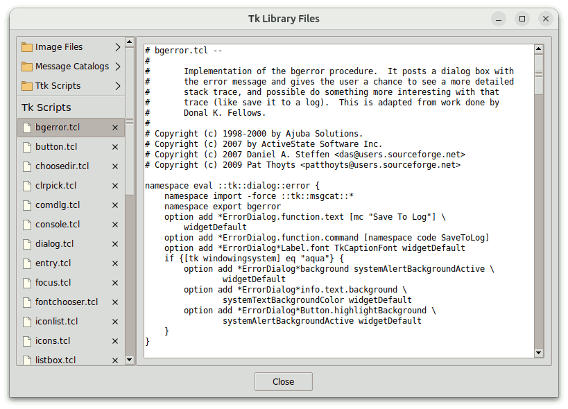
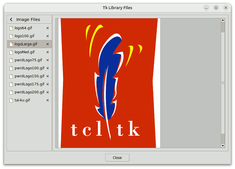
The script PagesManDemo.tcl in the demos
directory demonstrates the use of the scrollutil::pagesman widget having scrollutil::plainnotebook widgets as pages. It
creates a pagesman widget and adds four plainnotebook children as pages to
it. The panes of the first page display the contents of the Tk library
files, to be found in the directory $tk_library. The panes
of the three other pages display the contents of the GIF image files, message
catalogs, and Ttk scripts, situated in the subdirectories
images, msgs, and (for Tk 8.5a5 and later)
ttk, respectively.
The user can switch from the first page to the three other ones with the
aid of the three toolbuttons displaying a folder image and the descend style element. To
switch back, he or she has to use the ascend toolbutton, shown in the
top-left corner of the respective plainnotebook widget.
Here is the relevant code:
package require scrollutil_tile
set dir [file dirname [info script]]
source [file join $dir styleUtil.tcl]

wm title . "Tk Library Files"
wm withdraw .

#
# Create two images corresponding to the display's DPI scaling level
#
if {$tk_version >= 8.7 || [catch {package require tksvg}] == 0} {
    set fmt $scrollutil::svgfmt
    image create photo fileImg   -file [file join $dir file.svg]   -format $fmt
    image create photo folderImg -file [file join $dir folder.svg] -format $fmt
} else {
    set pct $scrollutil::scalingpct
    image create photo fileImg   -file [file join $dir file$pct.gif]   \
        -format gif
    image create photo folderImg -file [file join $dir folder$pct.gif] \
        -format gif
}

#
# Populates a given plainnotebook widget with panes that display the contents
# of the files of the specified suffix within the current working directory
#
proc populateNotebook {nb sfx} {
    set currentTheme [styleutil::getCurrentTheme]
    set panePadding [expr {$currentTheme eq "aqua" ? 0 : "9p"}]
    foreach fileName [lsort -dictionary [glob *.$sfx]] {
        set baseName [string range $fileName 0 end-4]
        set sa [scrollutil::scrollarea $nb.sa_$baseName]
        $sa configure -xscrollbarmode none -yscrollbarmode static ;# temporarily
        if {$sfx eq "gif"} {
            set canv [canvas $sa.canv -background #c0c0c0]
            set img [image create photo -file $fileName -format gif]
            $canv create image 15p 15p -anchor nw -image $img
            bind $canv <Configure> [list setScrollRegion %W %w %h $img]
            scrollutil::addMouseWheelSupport $canv
            $sa setwidget $canv
        } else {
            $sa configure -lockinterval 10
            . . .
        }
        $nb add $sa -text $fileName -image fileImg -compound left \
                    -padding $panePadding
    }
}

#
# Create a pagesman widget
#
set f [ttk::frame .f]
set pm [scrollutil::pagesman $f.pm -leavecommand pmLeaveCmd]

#
# Add option database entries for the -closabletabs,
# -forgetcommand, and -leavecommand plainnotebook options
#
option add *Plainnotebook.closableTabs  1
option add *Plainnotebook.forgetCommand condCopySel
option add *Plainnotebook.leaveCommand  saveSel

#
# Create a plainnotebook child displaying the contents of the Tk library files
#
set nbTk [scrollutil::plainnotebook $pm.nbTk]
$pm add $nbTk
$nbTk addbutton 1 "Image Files"      folderImg
$nbTk addbutton 2 "Message Catalogs" folderImg
$nbTk addbutton 3 "Ttk Scripts"      folderImg
$nbTk addseparator
$nbTk addlabel "Tk Scripts"
cd $tk_library
populateNotebook $nbTk "tcl"

#
# Create a plainnotebook child displaying the images for the Tcl (Powered) Logo
#
set nbImgs [scrollutil::plainnotebook $pm.nbImgs -caller 0 -title "Image Files"]
$pm add $nbImgs
cd $tk_library/images
populateNotebook $nbImgs "gif"

#
# Create a plainnotebook child displaying the contents of the message catalogs
#
set nbMsgs [scrollutil::plainnotebook $pm.nbMsgs -caller 0 -title \
            "Message\nCatalogs"]
$pm add $nbMsgs
cd $tk_library/msgs
populateNotebook $nbMsgs "msg"

#
# Create a plainnotebook child displaying the contents of the Ttk library files
#
set nbTtk [scrollutil::plainnotebook $pm.nbTtk -caller 0 -title "Ttk Scripts"]
$pm add $nbTtk
### cd $tk_library/ttk          ;# works for Tk versions 8.5a5 and later only
cd [expr {[info exists ttk::library] ? $ttk::library : $tile::library}]
populateNotebook $nbTtk "tcl"

proc setScrollRegion {canv canvWidth canvHeight img} {
    #
    # Use a margin of 15p around the image
    #
    set pixels [expr {30 * [tk scaling]}]
    set rightX [expr {[image width  $img] + $pixels}]
    set lowerY [expr {[image height $img] + $pixels}]
    if {$rightX < $canvWidth}  { set rightX $canvWidth }
    if {$lowerY < $canvHeight} { set lowerY $canvHeight }
    $canv configure -scrollregion [list 0 0 $rightX $lowerY]
}

proc pmLeaveCmd {pm nb} {
    set widget [$nb select]
    if {$widget eq ""} {
        return 1
    } else {
        return [saveSel $nb $widget]
    }
}

proc condCopySel {nb widget} {
    global nbImgs
    if {$nb eq $nbImgs || [winfo class $widget] ne "Scrollarea"} {
        return 1
    }

    . . .
}

proc saveSel {nb widget} {
    global nbImgs
    if {$nb eq $nbImgs || [winfo class $widget] ne "Scrollarea"} {
        return 1
    }

    . . .
}


#
# For each plainnotebook create bindings for moving and closing its tabs
# interactively, as well as for the virtual event <<NotebookTabChanged>>
#
foreach nb [$pm pages] {
    bind $nb <<MenuItemsRequested>> { populateMenu %W %d }
    bind $nb <<NotebookTabChanged>> { restoreSel %W }
}

proc populateMenu {nb data} {
    . . .
}

proc restoreSel nb {
    . . .
}

. . .

wm deiconify .
tkwait visibility $pm
after 400 [list configScrollareas $pm]

proc configScrollareas pm {
    wm geometry . [wm geometry .]
    foreach nb [$pm pages] {
        foreach w [$nb tabs] {
            if {[winfo class $w] eq "Scrollarea"} {
                $w configure -xscrollbarmode dynamic -yscrollbarmode dynamic
            }
        }
    }
}
The four pages of the pagesman widget, created by using the latter's
add subcommand, will have the
numerical indices 0, ..., 3. We pass the page
indices 1, 2, and 3 to the first
plainnotebook's addbutton subcommand, with which we
create the three toolbuttons used to descend from this page to the other
ones. When we create the three other plainnotebook widgets, we set
their -caller option to
0, which will make their ascend toolbutton visible and will make
sure that invoking this button will switch back to the first
plainnotebook.
The panes of all the four plainnotebook widgets are scrollareas that wrap text and canvas widgets,
respectively. By temporarily configuring the scrollarea widgets
with -xscrollbarmode none -yscrollbarmode static, we
make place for up to 80 characters of up to 30 text lines, plus the vertical
scrollbar. We wait for the pagesman widget to appear on the screen, and
400 milliseconds later we invoke the configScrollareas
proceedure, which freezes the application window's geometry and resets the
above-mentioned scrollarea options to their default value
dynamic. Due to the frozen geometry, the horizontal
scrollbars, when shown, won't make the window higher.